english-for-designers
Illustration system and color palette
Shoptet
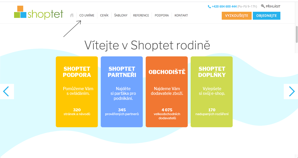
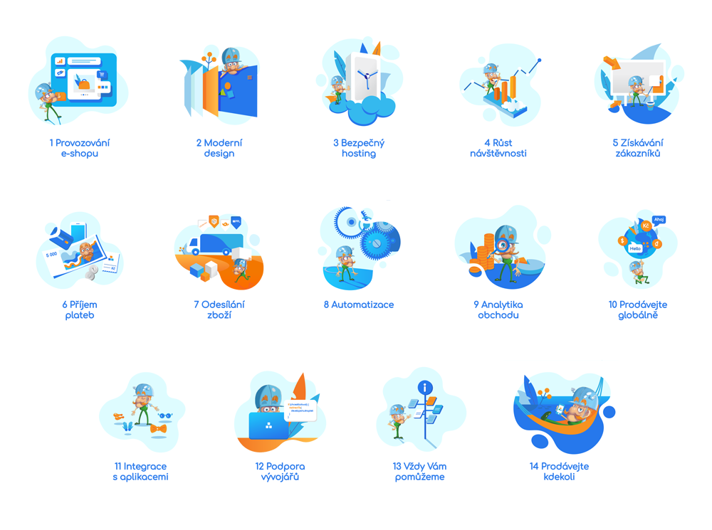
Being an e-commerce platform Shoptet’s business is based predominantly on the internet. More specifically on their page shoptet.cz. It is the face that they’re showing to the world and therefore one of the most important part of their business. Shopted aimed to make the main page and the first subpage “What we do” more visually attractive for users and the marketing team decided that illustrations with their mascot are the key. There are 14 main services that Shopted offers and each of them needed an illustration. That is when I got contacted.
Brief
In the beginning, I was asked for the first three illustrations as a trial. I was given the names of the 3 categories with short description for each.
- Safe hosting
- Site traffic boost
- Marketing
Shoptet’s conditions:
- Each illustration has to include Shoptet’s mascot Shoptetrix.
My conditions:
- Giving each illustration a concept that will fit the category and its description the best.
- Creating an illustration system that will fit the overall visual style of the website, with emphasis on the colors.
Color palette
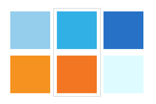
I started by creating a color palette that would fit the website design. There are three colors in the Shoptet’s logo - orange, blue and green. The green is already represented by the Shoptetrix’s outfit by default. Therefore I left green out of the color palette and reserved it for Shoptetrix only, ensuring that he would always stand out in the image. Instead, I focused on the orange and the blue. I matched the two with other tones of orange and blue ending up with two harmonious palettes complementing each other and preparing a great base for mostly green Shoptetrix.
First round of illustrations
Here you can see the concepts I created.
On image: Safe hosting, site traffic boost, marketing

Final product
After that I got a list of all of the services with a short description and finished the whole series.
The outcome
When the series was finished the individual illustrations were implemented into the website.
First the main page:
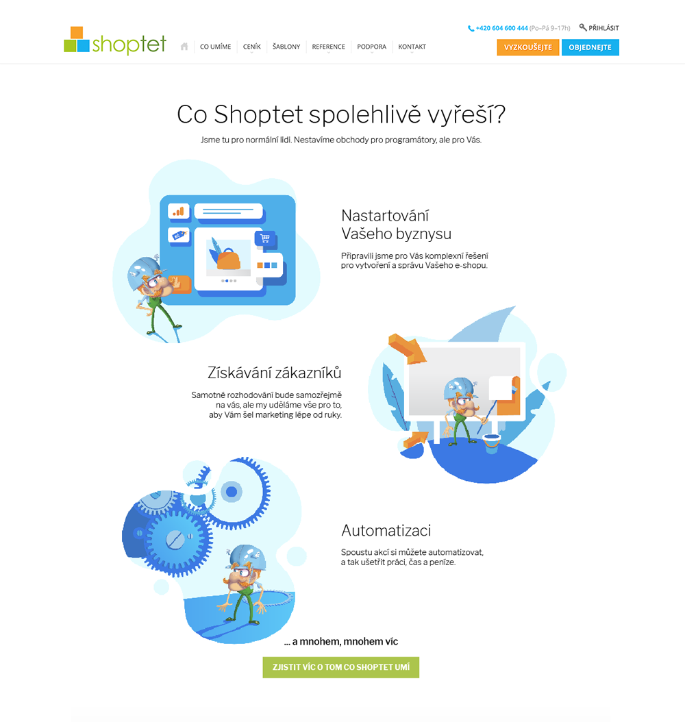
Then the “What we do” subpage
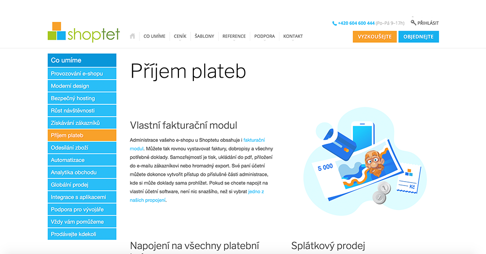
The redesign resulted in a more friendly and professional looking environment which helps to build trust with the customers. Shoptet also gained an illustration system which other designers can follow.
Link to the website: www.shoptet.com