english-for-designers
Digest: Rediscovering Karolina Světlá
Rediscovering Karolina Světlá
Author Name: Diana Štěpničková
E-mail: dianastepnickova@gmail.com
Acknowledgements: I would like to thank Mr. MgA. Miroslav Roubíček for the advice and guidance in the development of this thesis and also throughout my studies. Furthermore to Mr. Mgr. Jaroslav Tvrdoň for the typographic knowledge and the expert information he provided me with during the preparation of “The Village Novel”, and to my family for their support.
Data Accessibility/Availability Statement: There is no data archived.
Word count: 497
Digest: Rediscovering Karolina Světlá
Abstract
By redesigning a bookseries Ještědské romány I would like to reintroduce a significant czech writter from the group May School, and one of the first czech feminists – Karolina Světlá.
Keywords
book series, feminism, graphic design, Karolina Svetla, May School
Main Text
This paper is focuses on creating a unified visual identity for the book series Ještědské romány and connecting it with a suitable marketing solution. The result should help reintroduce the author to the age group of 18 to 30 year olds and marketing of her books.
Karolina Světlá is a Czech writer from the May School group and one of the first Czech feminists. The first part of the research focuses on the writer’s life story, reviews her work and merits in the field of feminism and a glimpse into to the belongings in the Podještědské Museum in Český Dub. The next part examines the development of the book “The Village Novel”, one of the books from the Ještědské romány series, from 1867 to 2019. The chronological list of all editions reveals the different approaches to design and typography due to the changing technological improvements in book printing. It also shows the different stages of the perception of the author itself. From underground writer printed in national revival publications to a national hero with gold woven books to the almost forgotten writer lost in a classical literature collections. The final part of the research examines today’s book printing techniques, insights into the book market, and the importance of e-books.
The graphic solution in the practical part strives to connect the old elements with the new one so that the books remain true to their content, but are at the same time addressing the target group.
References
Images
First, I needed to edit the photographs of the inheritance and other historical objects, which will become a key visual element of the book edition. I started by testing different digital effects on photos, which I also tried to combine with a suitable color palette. During testing, I observed how the mood of the photos changed with different colors and effects. With low intensity effects in combination with less saturated colors, the illustrations looked museumy and didn’t look modern enough to balance the historical content. On the contrary, with a high intensity effects and too bright colors, there was a readability problem.
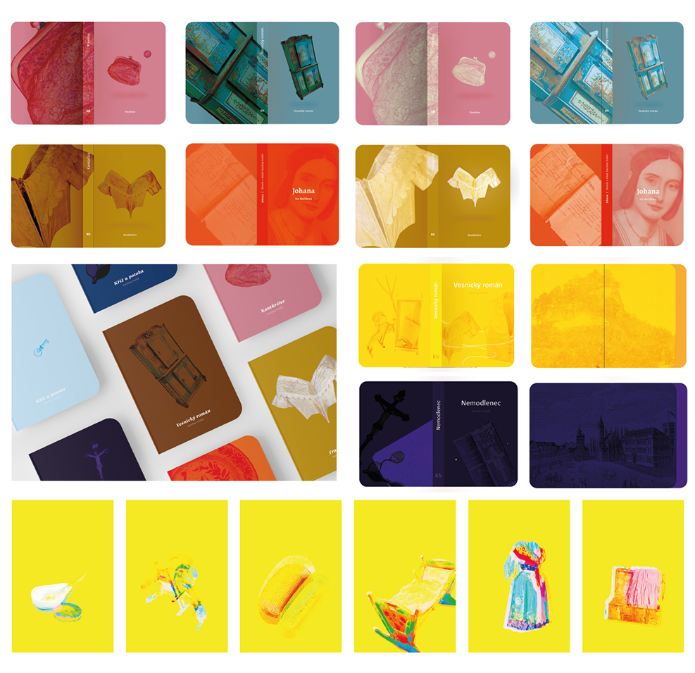
Illustration series for “The Village Novel”
I tried to find the ideal balance in which the illustrations would look modern and retain their readability. I chose a cheerful color palette with lighter, rich colors and created a series of illustrations for the book called “The Village Novel”.
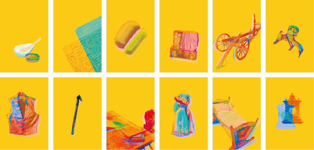


Cover design
I applied the illustrations to the book covers and chosen chapters in the book so that they always accompany the story.
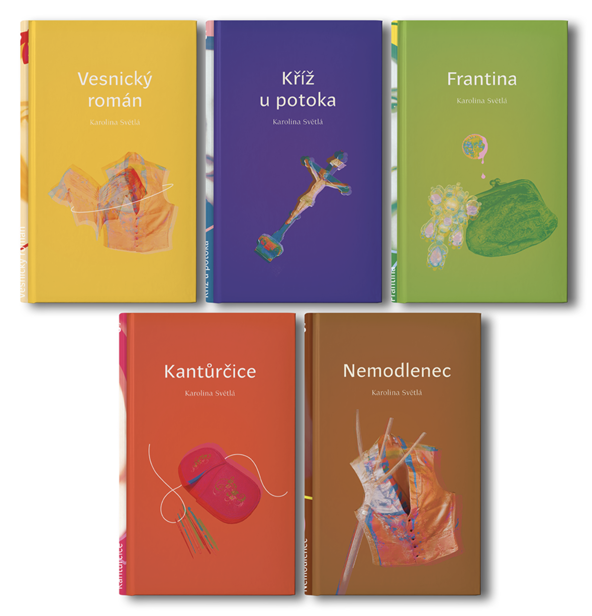
Inside “The Village Novel”
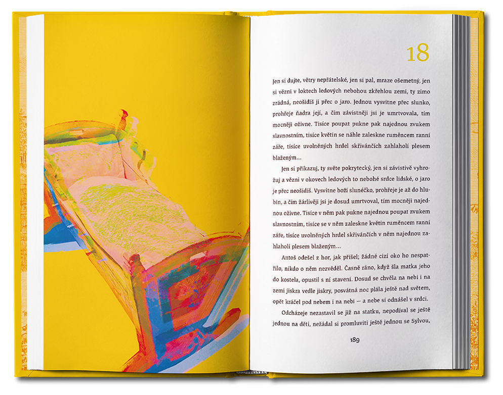
Unified visual identity
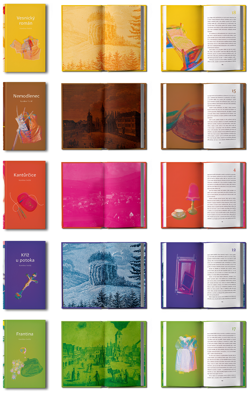
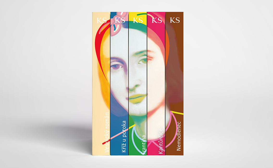
Book spines forming an image of Karolina Svetla
